Enhance your visual programming and visual modeling techniques with WaveMaker
Data, data, data! It’s everywhere and in large volumes in this data-driven world. What makes data valuable is how it is depicted and interpreted to translate it into information. To make this possible, data visualization using visual programming is used to drive decisions to solve real-world problems. Who would prefer scrolling through spreadsheets over a chart or a map? Probably not many.
With the use of IoT (Internet of things) and connected devices, there is a constant stream of information, leading to a large volume of data (Big Data). From demographic data, consumer behavior information, device usage stats, application downloads to marketing campaign effectiveness, data has become the driving force that powers decision-making in every sphere, across industries. To capitalize on this powerhouse of information is something that every enterprise is working towards.
How do you process such a vast volume of information? How do you interpret yottabytes of data? That’s one septillion bytes! What has made data more digestible is the use of visual programming and visual modeling techniques. By transforming numbers into visual elements such as charts, maps, graphs, and tables, data visualization has become crucial in supporting real-time decision making.
Let’s take real-world problems of the ongoing COVID-19 crisis, the importance of numbers has never been more crucial. Solving real-world problems require progressive solutions, one that low-code platforms have risen to offer. Low-code platforms have taken visual programming to the next level. With easy-to-use, drag and drop features, and customizable widgets, low-code platforms make visual modeling a breeze and help to create device-agnostic, critical applications with responsive dashboards.
To describe low-code’s claim to fame in a sentence, consider this – “It took a single developer 1 week to build an entire application!”
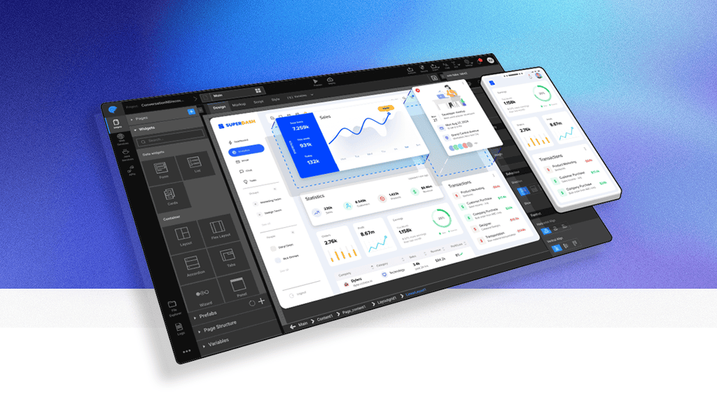
Let’s take the Corona Tracker application for example. There are several API sources available with COVID-19 data. Using WaveMaker, you can instantly build a dashboard, plot a map, or create a chart to visualize data from any source. Without any need for coding, visual programming and visual modeling just got easier and by using built-in widgets and dashboards, applications can be built in a few days. Take a look at this time-lapse screenshot of the WaveMaker application created within days…

For the user, the dashboard is the first point of visual contact with an application. The sum of the effort and time spent on visual programming is evident in how well a dashboard is designed. How responsive and accessible it is will define the success of the application.
With WaveMaker, not only can you create a powerful dashboard with speed, but you also make sure it is responsive and is accessible on mobile devices and large screens. The Corona Tracker application showcases an extensive dashboard with key metrics such as confirmed cases, recoveries, and deaths reported across several countries. For instance, using the dashboard, you can compare the death rates of the top 10 affected countries against their recovery percentages, and the number of affected people per million in a population, providing valuable information about how the situation is transpiring.
Corona Tracker Application Dashboard

What would it take to build the elements of a dashboard like this? Using WaveMaker, building a dashboard requires minimal visual programming and takes just 4 steps without writing any code. All that you need to do is…
Import from the data source (REST APIs)
Create variables to access the REST API
Drag-n-drop widgets on to the editor or canvas
Bind the widgets to variable.
To find out more about how you can create a responsive dashboard using WaveMaker, read this blog.
Graphical representation – that’s the whole premise of visual modeling. Depicting data in the form of charts, maps or graphs makes it easier to interpret. In the Corona Tracker application example, besides the dashboard it also features data charts and maps. By integrating data released by John Hopkins University, you can visualize the situation worldwide across a timeline through interactive charts and maps. What low-code has changed is that within a few clicks, you can apply visual modeling methods with minimal coding efforts.
Use Drag-n-Drop Visualization Techniques and Customize Datasets to Build Charts
Typically, in conventional visual modelling methods, creating a customized chart required writing many lines of code. With low-code, charts with custom metrics can be created with just a few clicks. To build plots for visualization in the application, WaveMaker has in-built, nvd3-based charts. You can drag-n-drop the chart widget on to the editor or canvas and bind the dataset property to the Variable to plot the data, as depicted below…
Drag-n-Drop Widgets for Chart Visualization

While this how a basic chart is plotted, when it comes to customizing a dataset, low-code plays an important part by using JavaScript visual programming. In this example, from the data of 180+ countries provided in the API, you can choose the top 10 countries and calculate the metrics for the “rest of the world” by writing JavaScript code. Once the API response is fetched, you can calculate custom metrics and create a dataset based on how you want to visualize data.
A map that graphically depicts data is not easy to create and not all platforms have in-built widgets. With WaveMaker, you can create a Prefab using JavaScript library datamaps. By taking the JSON input for countries and a colormap along with the code, you can plot the visualization you intend to create.
Prefabs or widgets are typically built by JavaScript developers, those who have visual modelling experience, and the knowledge of working with a JavaScript library. In a prefab project, the widget, created as a reusable component, can be published to the workspace by dropping it on to the canvas. By adding test data through the editor, the prefab can also be easily tested separately from the application.

In today’s data-driven world, data visualization is integral. Visual programming tools have been around for decades. Remember 25 years ago, how Visual Basic and Access was used to generate User Interfaces (UIs) from a database, automatically? While conventional visual programming tools made data visualization simpler, more often than not, it involved writing several lines of code, and in time it became considerably more complex and difficult to understand and write code. Taking the same concepts of older visual programming languages, data visualization has evolved with the introduction of low-code platforms.
What low-code brings to the table is the ease at which data visualization can be achieved, with minimal coding and maximum value. With the speed at which applications need to be developed today, developers are under immense pressure to achieve delivery timelines. Irrespective of the industry sector, whether the objective is to visualize data, deliver a personalized customer experience or modernize legacy systems, business-critical applications are being developed at greater speed. Low-code provides professional developers with the much-required agility that they need to develop customized applications at greater speed.
Think about it, the Corona Tracker application was built in a week. There are so many possibilities to build critical business apps that can help enterprises move on to the next level.
Enhance your visual programming and visual modeling techniques using low-code.